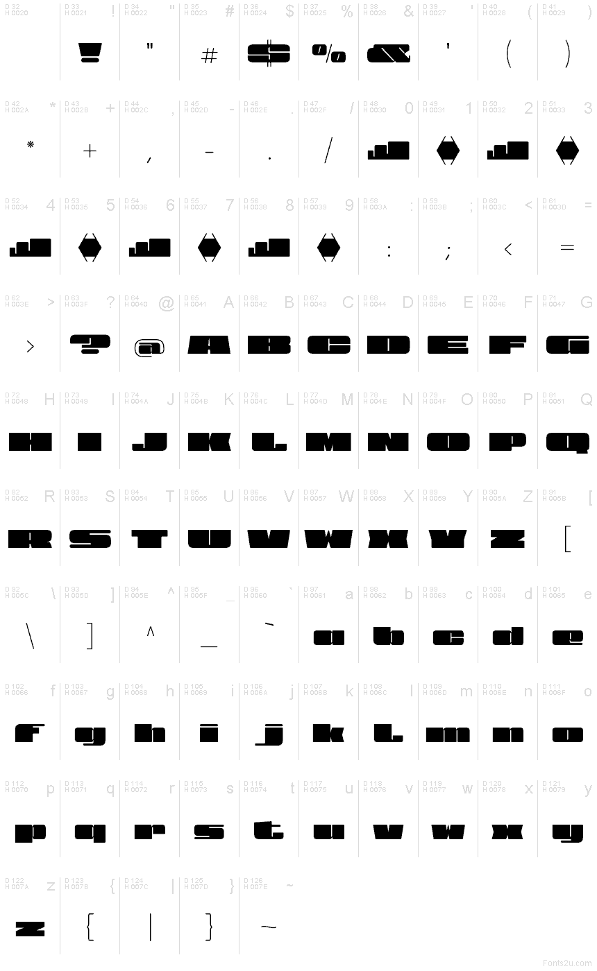
View Roman Black
TrueTypePre osobnú potrebu
- Akcenty (čiastočné)
- Euro
View-Black-Roman-FTP.ttf
Tagy
Poznámka autora
View Roman Black font by Fernando Haro aka deFharo is a free black retro display font built on thick, modular shapes and chiselled counters. Its defining feature is the carved, almost stencil-like negative space that slices through monolithic strokes, giving each letter a bold, high-contrast silhouette with a crisp, arcade-era snap. Within the View Roman family, this weight lands with a dense, blocky rhythm that reads loud at a glance and leaves a clean geometric afterimage.
Using View Roman Black, headlines lock up tightly and feel engineered: great for posters, retro-tech branding, album covers, event titles, sports graphics, signage, and bold packaging. The sturdy spacing keeps words compact without muddying the forms, so short lines hit hard and stay legible. Pair this free font with a light geometric sans for body copy, or push it large with generous tracking to let those sculpted counters breathe.
--
Znaková sada
Pomocou rozbaľovacieho menu si môžete pozrieť kompletnú ponuku znakových sád.

Základné informácie
Zmienka o autorských právach
Copyright (c) 2025 by deFharo. All rights reserved.
Rodina písma
View Roman Black
Podrodina písma
Regular
Unikátna identifikácia podrodiny
Version 1.235;DFHA;ViewRoman-Black;2025;FL842
Celý názov písma
View Roman Black
Verzia tabuľky názvu
Version 1.235
Postskriptový názov písma
ViewRoman-Black
Zmienka o ochrannej značke
View Black is a trademark of deFharo.
Výrobca
Dizajnér
Popis
View Roman is designed to stand out, make an impact, and dominate any visual space with elegance.
Its exaggeratedly wide proportions and black weight don't ask for permission: each letter is a statement of presence, an explosion of character that doesn't go unnoticed. It's made for those who appreciate the impact of super-thick and extra-wide typefaces.
Its shapes are pure power, with a perfect balance between the strength of the Roman style and the dynamism of the Slanted.
Designed in two versions—Roman and Slant—View is a font that combines the strength of a powerful stroke with the elegance of refined details.
Rozšírené informácie
Podporované platformy
PlatformaKódovanie
UnicodeUnikód 2.0 a nasledovná sémantika, len BMP unikód
MacintoshZápadné (roman)
MicrosoftLen BMP unikód
Podrobnosti
Vytvorené2025-07-13
Revízia1
Počet znakov233
Jednotiek na Em1000
Práva vloženiaVloženie zakázané!
Klasifikácia rodinyBez klasifikácie
VáhaUltra tučné
ŠírkaVeľmi široké
SmerZnaky smerované zľava doprava + neutrály
Štýl vzorkyNormálny
RoztečRôzna