Obesum Caps ExtBlk Exp
TrueTypePre osobnú potrebu
- Euro
Obesum-Caps-FFP.ttf
Tagy
Poznámka autora
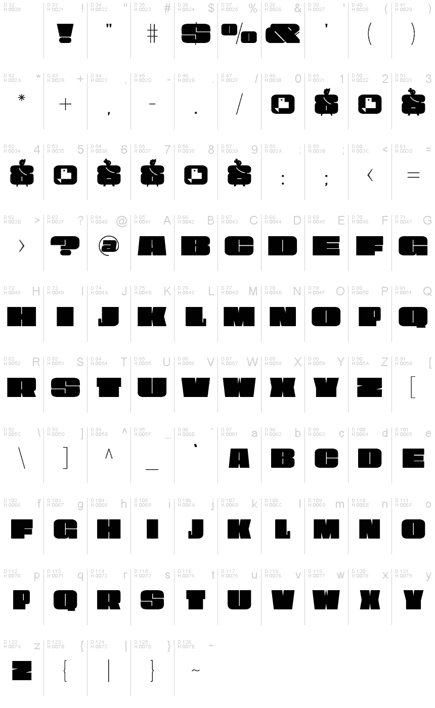
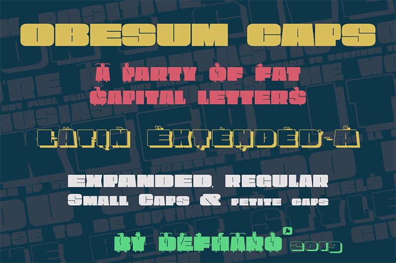
Obesum Caps is a very thick geometric display typeface with great contrast in the counterforms, it is made in homage to the capital letters and obese girls.
The font has five sets of uppercase letters: Capital letters are extended, lower case letters are more squares, and there is a version in small caps of a semi-expanded proportion, all of them with idiomatic support for Latin Extended-A, in addition to the standard alphabet and numbers in small size for the positions: Inferior, Denominator, Numerator and Superior, the letters and numbers have support for dynamic fractions and ordinals, besides the numbers have 3 different set: The normal numbering extended with the height of the capitals, old numbers to use with the small caps version of the letters and that have the height of the x and finally a third version of numbers for annotations.
I have enjoyed the forms and counterforms of this typeface so much that I have drawn an alternate alphabet to the tiny letters with figures of very sophisticated obese girls that are going to party, I hope you like it.
==============
FULL VERSIONS & LICENSES: https://defharo.com/fonts/obesum-ultra-caps/
Znaková sada
Pomocou rozbaľovacieho menu si môžete pozrieť kompletnú ponuku znakových sád.

Základné informácie
Zmienka o autorských právach
Copyright (c) 2019 by deFharo. All rights reserved.
Rodina písma
Obesum Caps ExtBlk Exp
Podrodina písma
Regular
Unikátna identifikácia podrodiny
Version 1.196;DFHA;ObesumCaps-ExtraBlackExpanded;2019;FLVI-613
Celý názov písma
Obesum Caps ExtBlk Exp
Verzia tabuľky názvu
Version 1.196
Postskriptový názov písma
ObesumCaps-ExtraBlackExpanded
Zmienka o ochrannej značke
Obesum Caps is a trademark of deFharo.
Výrobca
Dizajnér
Popis
Obesum Caps is a very thick geometric typeface with great contrast in the counterforms, it is made in homage to the capital letters and obese girls. The font has five sets of uppercase letters: Capital letters are extended, lower case letters are more squares, and there is a version in small caps of a semi-expanded proportion, all of them with idiomatic support for Latin Extended-A, in addition to the standard alphabet and numbers in small size for the positions: Inferior, Denominator, Numerator and Superior, the letters and numbers have support for dynamic fractions and ordinals, besides the numbers have 3 different set: The normal numbering extended with the height of the capitals, old numbers to use with the small caps version of the letters and that have the height of the x and finally a third version of numbers for annotations.
I have enjoyed the forms and counterforms of this typeface so much that I have drawn an alternate alphabet to the tiny letters with figures of very sophisticated obese girls that are going to party, I hope you like it.
I have enjoyed the forms and counterforms of this typeface so much that I have drawn an alternate alphabet to the tiny letters with figures of very sophisticated obese girls that are going to party, I hope you like it.
Rozšírené informácie
Podporované platformy
PlatformaKódovanie
UnicodeUnikód 2.0 a nasledovná sémantika, len BMP unikód
MacintoshZápadné (roman)
MicrosoftLen BMP unikód
Podrobnosti
Vytvorené1969-12-31
Revízia1
Počet znakov189
Jednotiek na Em1000
Práva vloženiaVloženie zakázané!
Klasifikácia rodinyBez pätiek
VáhaUltra tučné
ŠírkaŠiroké
SmerZnaky smerované zľava doprava + neutrály
Štýl vzorkyNormálny
RoztečRôzna
