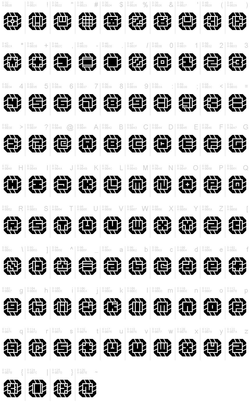
Might Chain Regular
TrueTypeFreeware
might-chain.ttf
Tagy
Poznámka autora
Some kind of great big ol' chain!
When glyphs are used in isolation, they somewhat resemble carved signets or seals. Increasing the letter spacingallows you to create a variation of the design. (This is something that must be done in-software since the font will render as monospaced by default.)
When glyphs are used in isolation, they somewhat resemble carved signets or seals. Increasing the letter spacingallows you to create a variation of the design. (This is something that must be done in-software since the font will render as monospaced by default.)
Znaková sada
Pomocou rozbaľovacieho menu si môžete pozrieť kompletnú ponuku znakových sád.

Základné informácie
Zmienka o autorských právach
Copyright zephram 2018
Rodina písma
Might Chain
Podrodina písma
Regular
Unikátna identifikácia podrodiny
Might Chain
Celý názov písma
Might Chain Regular
Verzia tabuľky názvu
Version 1.0
Postskriptový názov písma
Might-Chain
Zmienka o ochrannej značke
FontStruct is a trademark of FontStruct.com
Výrobca
Dizajnér
Popis
“Might Chain” was built with FontStruct
Designer description: Some kind of great big ol' chain.
In retrospect, I think it looks like a jewelry chain from a dwarven civilization. Perhaps the hypothetical jeweler cut and ground the stones in an imitation of some dwarven font!
When glyphs are used in isolation, they somewhat resemble carved signets or seals. Increasing the letter spacing allows you to create a variation of the design. (This is something that must be done in-software since the font will render as monospaced by default.)
*
12SEP2018: Added lowercase... the low resolution combined with the design method make it very difficult to render distinctive lowercase versions of every letter, but I'll keep working on it. There's a lot of similarity between pairs like S/5, Z/2, etc., so this font is most effectively used in forms of writing wherein context suffices to inform the reader as to the identity of each glyph (lists, prose, and technical writings). If you want to use this in a password system or something, I recommend using one case's glyphs only.
*
Design Rules:
1. Negative spaces will be areas of 0.5 bricks' effective length or width.
2. Negative spaces may exceed the 0.5 measurement only by increments of 0.5 and in only one dimension at a time.
3. Glyphs will fill their framed canvasses to the greatest extent possible while adhering to the other rules.
Rozšírené informácie
Podporované platformy
PlatformaKódovanie
MicrosoftLen BMP unikód
UnicodeUnikód 2.0 a nasledovná sémantika, len BMP unikód
Podrobnosti
Vytvorené2018-10-18
Revízia1
Počet znakov102
Jednotiek na Em4096
Práva vloženiaVloženie povolené len na prezretie a tlač
Klasifikácia rodinyBez klasifikácie
VáhaVeľmi tučné
ŠírkaStredné (normálne)
Mac štýlTučné
SmerZnaky smerované zľava doprava + neutrály
Štýl vzorkyNormálny