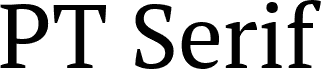
PT Serif Caption from ParaType Ltd. is a free serif font with broad proportions, firm serifs, and pronounced changes between sturdy verticals and finer cross strokes. Rounded curves soften its otherwise formal drawing.
In publishing, it lends editorial titles and introductory text a traditional structure with enough weight to sit confidently near photography. The same measured shapes suit book covers, museum signage, and packaging for heritage-minded products. Editorial design is its clearest role, especially when a page needs formality without decorative excess.
PT Serif is a universal type family designed for use together with PT Sans released earlier. PT Serif coordinates with PT Sans on metrics, proportions, weights and design. It consists of six styles: regular and bold weights with corresponding italics form a standard computer font family; two caption styles (regular and italic) are for texts of small point sizes. The letterforms are distinguished by large x-height, modest stroke contrast, robust wedge-like serifs, and triangular terminals. Due to these features the face can be qualified as matched to modern trends of type design and of enhanced legibility. Mentioned characteristics beside conventional use in business applications and printed stuff make the fonts quite useable for advertising and display typography. Each font next to standard Latin and Cyrillic character sets contains alphabet glyphs of title languages of the national republics of Russian Federation and support the most of the languages of neighboring countries. The fonts were developed and released by ParaType in 2010 with financial support from Federal Agency of Print and Mass Communications of Russian Federation. Design -- Alexandra Korolkova with assistance of Olga Umpeleva and supervision of Vladimir Yefimov.
Rozšírené informácie o fonte
Podporované platformy
PlatformaKódovanie
UnicodeUnikód 2.0 a nasledovná sémantika, len BMP unikód