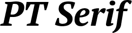
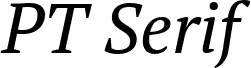
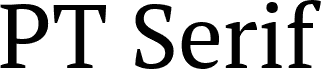
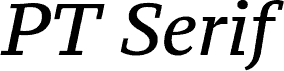
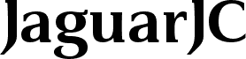
PT Serif Bold from ParaType Ltd. is a free traditional serif with broad, weighty letterforms and firmly bracketed serifs. Its stroke contrast gives the lettering an editorial texture, and the rounded lowercase shapes keep it from looking severe. The capitals are commanding but not overly condensed.
Historic photographs and classical illustration share the font's sober, bookish character, making it well suited to magazine covers and cultural posters. It also has the authority needed for museum publishing and heritage packaging, especially when the subject calls for established, literary associations. Magazine display work is its clearest role, since the dense strokes and familiar proportions hold attention without turning ornamental.
PT Serif is a universal type family designed for use together with PT Sans released earlier. PT Serif coordinates with PT Sans on metrics, proportions, weights and design. It consists of six styles: regular and bold weights with corresponding italics form a standard computer font family; two caption styles (regular and italic) are for texts of small point sizes. The letterforms are distinguished by large x-height, modest stroke contrast, robust wedge-like serifs, and triangular terminals. Due to these features the face can be qualified as matched to modern trends of type design and of enhanced legibility. Mentioned characteristics beside conventional use in business applications and printed stuff make the fonts quite useable for advertising and display typography. Each font next to standard Latin and Cyrillic character sets contains alphabet glyphs of title languages of the national republics of Russian Federation and support the most of the languages of neighboring countries. The fonts were developed and released by ParaType in 2010 with financial support from Federal Agency of Print and Mass Communications of Russian Federation. Design -- Alexandra Korolkova with assistance of Olga Umpeleva and supervision of Vladimir Yefimov.
Rozšírené informácie o fonte
Podporované platformy
PlatformaKódovanie
UnicodeUnikód 2.0 a nasledovná sémantika, len BMP unikód
MacintoshZápadné (roman)
MicrosoftLen BMP unikód
Podrobnosti fontu
Vytvorené2010-12-14
Revízia1
Počet glyfov719
Jednotky na em1000
Práva na vkladanieVloženie pre trvalú inštaláciu
Trieda rodinyPrechodné pätky
HrúbkaTučné
ŠírkaStredné (normálne)
Štýl MacŠikmé
SmerZnaky smerované zľava doprava + neutrály
Charakter vzoruTučný
RozstupRôzna
Kompletný balík obsahuje 5 rezov fontu uvedených nižšie: