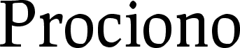
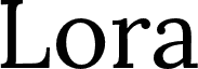
Prociono, designed by Barry Schwartz, is a free traditional serif with broad proportions and pronounced thick-to-thin strokes. Rounded forms keep the sturdy bracketed serifs from feeling severe.
Publishing and hospitality branding both benefit from that formal but approachable construction. It suits literary covers and magazine features, yet also feels at home on restaurant menus and wine labels. The softly modeled curves bring a crafted note to these settings, linking the lettering with engraved ornaments or botanical illustration.
--
I have placed the font in the public domain.
It is an OpenType font with class-based kerning and standard and discretionary ligatures.
The name is pronounced “pro-tsee-O-no.” It is an Esperanto word meaning either “raccoon” or the star Procyon.
This font has been released into the public domain by its author, Barry Schwartz. This applies worldwide.
In some countries this may not be legally possible; if so: Barry Schwartz grants anyone the right to use this work for any purpose, without any conditions, unless such conditions are required by law.
Rodina písma
Prociono
Podrodina písma
Regular
Unikátna identifikácia podrodiny
Foundry : Prociono Regular : 8-1-2007
Celý názov písma
Prociono Regular
Verzia tabuľky názvu
Version 2.2
Postskriptový názov písma
Prociono-Regular
Výrobca
The Crud Factory / La Rubejplenigejo
Dizajnér
Barry Schwartz
Rozšírené informácie o fonte
Podporované platformy
PlatformaKódovanie
UnicodeUnikód 2.0 a nasledovná sémantika, len BMP unikód