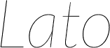
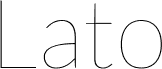
Lato Black, designed by Lukasz Dziedzic for tyPoland, is a free heavy sans serif with broad, firmly drawn letters. Its weight is dense, but rounded curves and generous inner spaces keep the forms from looking blunt. The lowercase stays compact and direct.
A confident retail or sports brand could use it across packaging, storefront signage, and campaign graphics. It also fits event posters and magazine covers because its substantial shapes hold their own beside large photography or flat illustration. Across these settings, the same sturdy proportions make names and messages look assertive, direct, and practical.
Copyright (c) 2010 by tyPoland Lukasz Dziedzic with Reserved Font Name "Lato". Licensed under the SIL Open Font License, Version 1.1.
Rodina písma
Lato Black
Podrodina písma
Regular
Unikátna identifikácia podrodiny
tyPoland LukaszDziedzic: Lato Black: 2010
Celý názov písma
Lato Black
Verzia tabuľky názvu
Version 1.010; Western character set
Postskriptový názov písma
Lato-Black
Zmienka o ochrannej značke
Lato is a trademark of tyPoland Lukasz Dziedzic.
Výrobca
tyPoland Lukasz Dziedzic
Dizajnér
Lukasz Dziedzic
Popis
Lato is a sanserif typeface family designed in the Summer 2010 by Warsaw-based designer Lukasz Dziedzic ("Lato" means "Summer" in Polish). It tries to carefully balance some potentially conflicting priorities: it should seem quite "transparent" when used in body text but would display some original traits when used in larger sizes. The classical proportions, particularly visible in the uppercase, give the letterforms familiar harmony and elegance. At the same time, its sleek sanserif look makes evident the fact that Lato was designed in 2010, even though it does not follow any current trend. The semi-rounded details of the letters give Lato a feeling of warmth, while the strong structure provides stability and seriousness.
Rozšírené informácie o fonte
Podporované platformy
PlatformaKódovanie
UnicodeUnikód 2.0 a nasledovná sémantika, len BMP unikód
MacintoshZápadné (roman)
MicrosoftLen BMP unikód
Podrobnosti fontu
Vytvorené2010-12-12
Revízia1
Počet glyfov263
Jednotky na em2000
Práva na vkladanieVloženie pre trvalú inštaláciu
Trieda rodinyBez pätiek
HrúbkaVeľmi tučné
ŠírkaStredné (normálne)
Štýl MacTučné
SmerZnaky smerované zľava doprava + neutrály
Charakter vzoruTučný
RozstupRôzna
Kompletný balík obsahuje 10 rezov fontu uvedených nižšie: