We The People
TrueTypePre osobnú potrebu
- Akcenty (čiastočné)
- Akcenty (plné)
- Euro
WeThePeople.ttf
Tagy
Poznámka autora
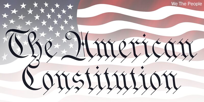
This typeface is extrapolated from the We the People calligraphy of the handwritten US Constitution Preamble which employed a style based on German Text and Square Text exemplars from George Bickhams penmanship copy-books, the most celebrated being 'The Universal Penman' published in 1743.
The original Constitution document was transcribed onto parchment by Jacob Shallus, a Pennsylvania Assistant Clerk, over a weekend in 1787. Shalluss biographer, Arthur Plotnik ('The Man Behind the Quill', 1987), notes that he was paid $30, a modest monthly wage at the time. He also suggests that the calligraphic headings, We the People and Article, may have been inserted by Shalluss 14 year old trainee son, Francis,
The manner in which the Article headings are squeezed into the space Shallus allowed for them suggests a second handand perhaps not a very experienced one.
The unconventional backslant of the headings would seem to support this contention, and at the end of the document there is perhaps a novices inconsistency in the structure of the letter n between that used for done and those used for In Witness. However, one has to admire the elegant swagger of the wavy t, h and l which the K-Type font extends to the b, f and k. Also, the simpler, Schwabacher-style W, an enlarged version of the lowercase w, is a little less flamboyant than the capital W from the German and Square texts in Bickhams manuals.
For designers using OpenType-aware applications, the typeface includes some Alternates, including a Bickham-style W, the letters t, h and n with added flourishes, two simpler forms of the A, and a few roman numerals for numbering articles. Also some ornamental flourishes and a round middle dot/decimal point. Punctuation marks are drawn in square, calligraphic style, but an alternative round period/full stop, for use with currency and numerals, is available at the period centered position (though placed on the baseline), accessed by Shift Option 9 on a Mac, or Alt 0183 on Windows. The full phrase, We the People, has been placed at the trademark keystroke and can be accessed by Shift Option 2 on a Mac, or Alt 0153 on Windows.
For designers who find the backslant awkward or unpleasant, the licensed typeface is available from k-type.com and includes two additional fonts which have a vertical aspect that may be more conducive to graphic design layouts. We The People Upright and We The People Upright Bold both retain the distinctive style, and the heavier weight is only slightly emboldened, just enough to add some punch.
The original, backslanted We The People font is free for personal use, and can be used freely by students and teachers at schools, colleges and universities, and by educational institutions themselves. The free font can also be used without licensing by public charities, museums, and libraries.
Znaková sada
Pomocou rozbaľovacieho menu si môžete pozrieť kompletnú ponuku znakových sád.

Základné informácie
Zmienka o autorských právach
We The People by Keith Bates • © 2021 www.k-type.com • This font is extrapolated from the We the People calligraphy of the handwritten US Constitution Preamble.
Rodina písma
We The People
Podrodina písma
Regular
Unikátna identifikácia podrodiny
pyrs: We The People: 2021
Celý názov písma
We The People
Verzia tabuľky názvu
We The People version 1.0 by Keith Bates • © 2021 www.k-type.com
Postskriptový názov písma
WeThePeople
Výrobca
Dizajnér
Keith Bates
Popis
The ‘We The People’ font is free for personal use. It can also be used unlicensed by students and teachers at schools, colleges and universities, by educational institutions themselves, and by public charities, museums, and libraries.
Rozšírené informácie
Podporované platformy
PlatformaKódovanie
UnicodeUnikód 2.0 a nasledovná sémantika, len BMP unikód
MacintoshZápadné (roman)
MicrosoftLen BMP unikód
Podrobnosti
Vytvorené2021-01-20
Revízia1
Počet znakov404
Jednotiek na Em1000
Práva vloženiaVloženie pre trvalú inštaláciu
Klasifikácia rodinyPísané (skriptové)
VáhaStredne ľahké
ŠírkaStredné (normálne)
Mac štýlTučné
SmerZnaky smerované zľava doprava + neutrály
Štýl vzorkyKurzíva
RoztečRôzna