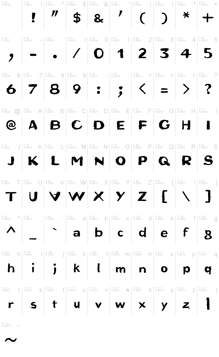
Bruta Woodcut
TrueTypeFreeware
- Akcenty (čiastočné)
- Akcenty (plné)
- Euro
Bruta_Woodcut.ttf
Tagy
Poznámka autora
Bruta Woodcut font is an eroded display font designed by Ingo Zimmermann.
An alphabet originally carved in wood
The German term for characters or letters is Buchstaben, literally Buche (beech) and Stab (rod or stick), and dates back to the Germanic custom of carving runic characters in beechwood sticks. On New Years Eve, 2014, I used the occasion to cut real beech characters myself. I carved all the characters of this font in woodcarving manner, without tracing and mirror-inverted, in smoothly planed beech rods. After printing on paper, the digital font you see here was created from the negative typeface.
Originally planning an alphabet of capital letters only, I ended up carving figures, punctuation marks and lower case letters after all. The capital letters emphasize alternation between bold and fine strokes, which is familiar in Roman typefaces. In this way, the upper case text in Bruta Woodcut obtains its very own aesthetics.
The ductus on the lower case letters is plainly not as distinct. They look more like a classical sans serif, which becomes clear as the smaller a text is set in Bruta Woodcut, the more legible it becomes.
The original image was negative. In contrast, the font consists of the positive typeface. Bruta Woodcut includes lots of ligatures and stylistic alternates for some symbols.
Thanks to OpenType and Unicode, Bruta Woodcut supports all Western European languages plus Central and Eastern European languages as well as Turkish.
Znaková sada
Pomocou rozbaľovacieho menu si môžete pozrieť kompletnú ponuku znakových sád.

Základné informácie
Zmienka o autorských právach
Copyright (c) 2015 by Ingo Zimmermann. All rights reserved.
Rodina písma
Bruta
Podrodina písma
Woodcut
Unikátna identifikácia podrodiny
IngoZimmermann: Bruta Woodcut: 2015
Celý názov písma
Bruta Woodcut
Verzia tabuľky názvu
Version 1.007
Postskriptový názov písma
Bruta-Woodcut
Zmienka o ochrannej značke
Bruta Woodcut is a trademark of Ingo Zimmermann.
Výrobca
Dizajnér
Popis
Copyright (c) 2015 by Ingo Zimmermann. All rights reserved.
Rozšírené informácie
Podporované platformy
PlatformaKódovanie
UnicodeUnikód 2.0 a nasledovná sémantika, len BMP unikód
MacintoshZápadné (roman)
MicrosoftLen BMP unikód
Podrobnosti
Vytvorené2015-01-06
Revízia1
Počet znakov364
Jednotiek na Em1000
Práva vloženiaVloženie pre trvalú inštaláciu
Klasifikácia rodinyVoľné pätky
VáhaTučné
ŠírkaStredne široké
Mac štýlTučné
SmerZnaky smerované zľava doprava + neutrály
Štýl vzorkyNormálny
RoztečRôzna
